
10 Common Donation Form Mistakes You Should Avoid


Table of Content
Download Paymattic – it’s Free!

Subscribe To Get
WordPress Guides, Tips, and Tutorials
We will never spam you. We will only send you product updates and tips.
Donation forms do one job: turn intent into action. But when the form feels too long, too confusing, or too untrustworthy, donors leave before completing the gift.
That means lost revenue, weaker donor relationships, and a worse experience for people who have already decided to support your cause.
The good news is that many donation page issues are easy to fix. Small changes to layout, copy, and form structure can make a noticeable difference in completion rates and donor confidence.
In this guide, we’ll walk through the 10 most common donation form mistakes, why they hurt conversions, and what you can do to fix them fast.
Why donation forms matter in fundraising
A donation form is not just a payment step. It is part of the donor experience, and it often decides whether someone follows through or bounces.
If your form feels clean, fast, and trustworthy, donors are more likely to finish. If it feels cluttered or unclear, even motivated supporters may hesitate.
That is why form design matters so much for nonprofits, NGOs, and fundraising teams using WordPress donation plugins.
How can small UX issues lead to lost donations?
A donor usually arrives with some level of goodwill already in place. The problem is that goodwill disappears quickly when the form asks for too much, takes too long, or creates doubt.
Common UX issues like extra fields, poor mobile layouts, or weak CTAs can quietly kill conversions. Most donors will not complain. They will just leave.
That’s why optimizing donation forms is less about fancy design and more about removing obstacles between the donor and the submit button.
The 10 common donation form mistakes
Here are the most common mistakes that fundraisers often make while creating a donation form.
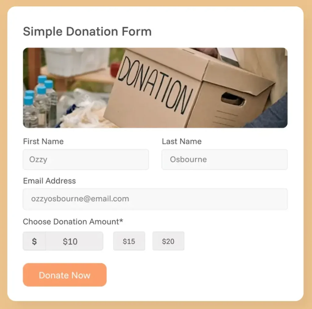
1. Too many form fields
A donation form should collect only what is necessary to complete the gift and send the receipt. Every extra field you add is a micro-negotiation you’re forcing your donor to have.
Name, address, phone number, date of birth, etc., before they’ve even entered a donation amount.
Each additional input increases mental load and the chance they’ll abandon. If it’s not required to process the gift or send a receipt, it has no business being there right now.
How to fix it:
Keep the form minimal. Ask only for the information you truly need to complete the donation and send the receipt. You need their email, not their marital status. If a field is optional, remove it or move it to a later follow-up step.
2. Lack of mobile optimization
Over half of web traffic is mobile. Your donation form, which looks fine on a desktop, can fall apart on a phone. If the layout feels cramped, buttons are hard to tap, or fields are awkward to fill out, donors will drop off fast.
How to fix it:
Use responsive design, large touch-friendly buttons, and a layout that works naturally on smaller screens. Test the full donation flow on mobile, not just the page preview.
Paymattic offers beautiful-looking, ready-to-use donation forms that are optimized for any device.
3. No suggested donation amounts
When you ask someone to type in their own amount with no guidance, you’ve handed them a blank page. Most people don’t know what’s “normal” to give, so they stall.
The drop-off often occurs during that pause, not because they don’t want to give, but because you made the decision harder. Suggested amounts help them make a quick decision and keep going.
How to fix it:
Add suggested giving options like $25, $50, $100, and $250. You can also include a custom amount field for flexibility, but the preset choices should make the decision easier.
4. Complicated checkout process
If the donation flow has too many steps, too many redirects, or too many surprise screens, it starts to feel like work. That is usually enough to make people quit before they finish.
Donating should feel like it takes 60 seconds, not like filing a form at the DMV.
How to fix it:
Simplify the flow as much as possible. Keep the donation process focused, reduce unnecessary clicks, and make sure the donor always knows where they are in the journey.
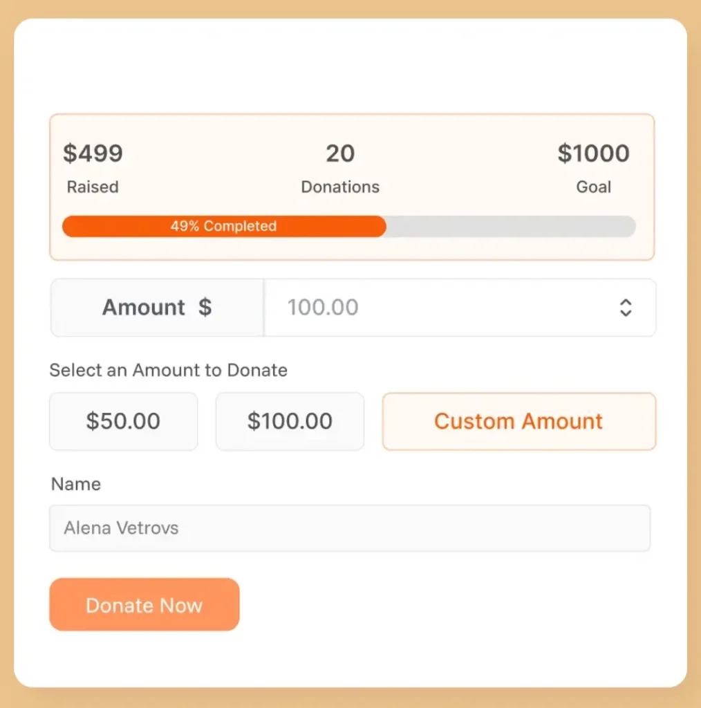
5. No donation progress bar
People are wired to contribute to things that are already moving. A fundraising campaign with no visible progress counter is a missed psychological opportunity.
When donors can’t see how close you are to a goal, they have no urgency to act and no sense that their gift makes a meaningful difference in reaching it. A blank campaign feels stagnant, even if donations are coming in steadily behind the scenes.
How to fix it:
Add a live donation progress bar showing how much has been raised toward a specific goal. Even a simple “68% funded” display creates momentum, builds social proof, and gives donors a reason to act now rather than later.
6. Lack of trust signals
When a donation form does not clearly look secure or legitimate, donors hesitate. Even small doubts about safety, branding, or organization details can stop someone from clicking submit.
How to fix it:
Add visible security indicators, make your organization’s details clear, and include short trust-building elements like testimonials or impact statements. Transparency matters more than decoration.
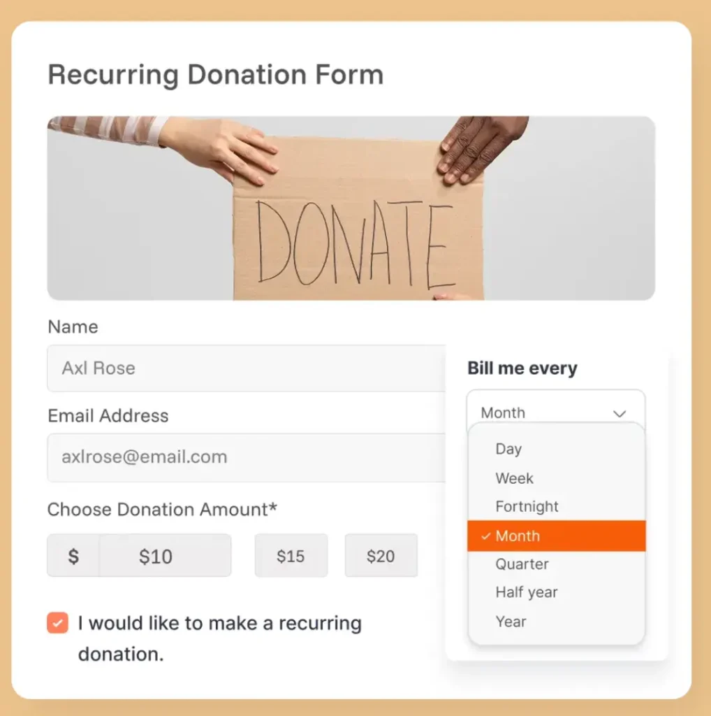
7. No recurring donation option
Many donors are happy to give monthly; they just need to be asked. If your form only supports one-time donations, you’re missing out on consistent, compounding revenue.
A monthly donor who gives $25/month is worth $300/year and is far more likely to stay engaged with your mission long-term.
How to fix it:
The fix is simple: add a recurring donation option with clear messaging about its impact. Make it easy for donors to choose between one-time and monthly giving without confusion. Keep all the billing cycles weekly/biweekly/monthly/yearly.
8. Poor call-to-action copy
The submit button might be the most important piece of copy on your entire form, and most organizations write “Submit” or “Continue.” That’s a missed opportunity.
Donors respond to language that reinforces what they’re doing and why it matters. A lifeless CTA drains the emotional energy that got them to this page in the first place.
How to fix it:
Use strong, action-driven CTA copy such as “Donate Now,” “Support Our Mission,” or “Give Today.” Make the button specific, visible, and aligned with the donor’s intent.
9. Confusing payment options
Payment should feel obvious and safe. If donors do not immediately see a payment method they trust, they may exit.
Offering multiple payment options is good, but too many irrelevant gateways can make your form confusing. Offer gateways that are familiar to your donors. If your campaign targets Indonesia, consider offering Xendit. No need to offer Mollie or BillPlz.
How to fix it:
Offer familiar, trusted payment options (Stripe, PayPal, and Apple Pay, where relevant) and present them clearly. Keep the payment step simple and make sure the donor can easily understand how their gift will be processed.
Subscribe Newsletter
Subscribe to our newsletter for updates, exclusive offers, and news you won’t miss!

10. No thank you or follow-up step
After someone gives, the experience should not just stop. A blank confirmation screen or a generic receipt feels cold and wastes a key moment to build trust and appreciation.
The donor just gave you money because they care about your cause, and you responded with silence. It damages future-giving possibilities.
How to fix it:
Create a proper confirmation page, appreciate their giving, and send a thank-you email right away. Use that moment to express gratitude, confirm the gift, and invite the donor to stay connected.
Best practices for high-converting donation forms
If you want to create a perfect donation form that performs well, keep these in mind:
- Keep the form short and focused
- Only add necessary fields
- Make sure the form is device-friendly
- Offer suggested donation amounts
- Reduce the number of steps in the donation flow
- Add trust signals wherever the donor might hesitate
- Add a donation progress bar
- Include a recurring donation option
- Use clear, compelling CTA copy
- Present payment options clearly
- End with a strong thank you and follow-up
The strongest donation forms are not the flashiest ones. They are the ones that feel easy, safe, and purposeful from start to finish.
Wrapping up
Most donation form mistakes are not dramatic. They are small frictions that quietly reduce conversions and make giving harder than it should be.
If you simplify the form, improve trust, and make the donation flow easier to complete, you can create a better donor experience and raise more support at the same time.
If you want a faster way to build fully customizable, beautiful-looking donation forms in WordPress, Paymattic gives you the flexibility to create forms that look good and convert better.
Join the thousands already enjoying Paymattic Pro!

Tipu Deb
Hey! Tipu here, working as a Marketing Strategist at WPManageNinja & Paymattic. A nature lover and a person who is addicted to exploring historical events. In my leisure, you’ll find me playing with different musical instruments.


Leave a Reply