This article will guide you through the process of customizing the date formats for your Date & Time field.
Date Formatting Tokens #
| Character | Description | Example |
|---|---|---|
| d | Day of the month, 2 digits with leading zeros | 01 to 31 |
| D | A textual representation of a day | Mon through Sun |
| l (lowercase ‘L’) | A full textual representation of the day of the week | Sunday through Saturday |
| j | Day of the month without leading zeros | 1 to 31 |
| J | Day of the month without leading zeros and ordinal suffix | 1st, 2nd, to 31st |
| w | Numeric representation of the day of the week | 0 (for Sunday) through 6 (for Saturday) |
| W | Numeric representation of the week | 0 (first week of the year) through 52 (last week of the year) |
| F | A full textual representation of a month | January through December |
| m | Numeric representation of a month, with leading zero | 01 through 12 |
| n | Numeric representation of a month, without leading zeros | 1 through 12 |
| M | A short textual representation of a month | Jan through Dec |
| U | The number of seconds since the Unix Epoch | 1413704993 |
| y | A two-digit representation of a year | 99 or 03 |
| Y | A full numeric representation of a year, 4 digits | 1999 or 2003 |
| Z | ISO Date format | 2017-03-04T01:23:43.000Z |
Time Formatting Tokens #
| Character | Description | Example |
|---|---|---|
| H | Hours (24 hours) | 00 to 23 |
| h | Hours | 1 to 12 |
| G | Hours, 2 digits with leading zeros | 1 to 12 |
| i | Minutes | 00 to 59 |
| S | Seconds, 2 digits | 00 to 59 |
| s | Seconds | 0, 1 to 59 |
| K | AM/PM | AM or PM |
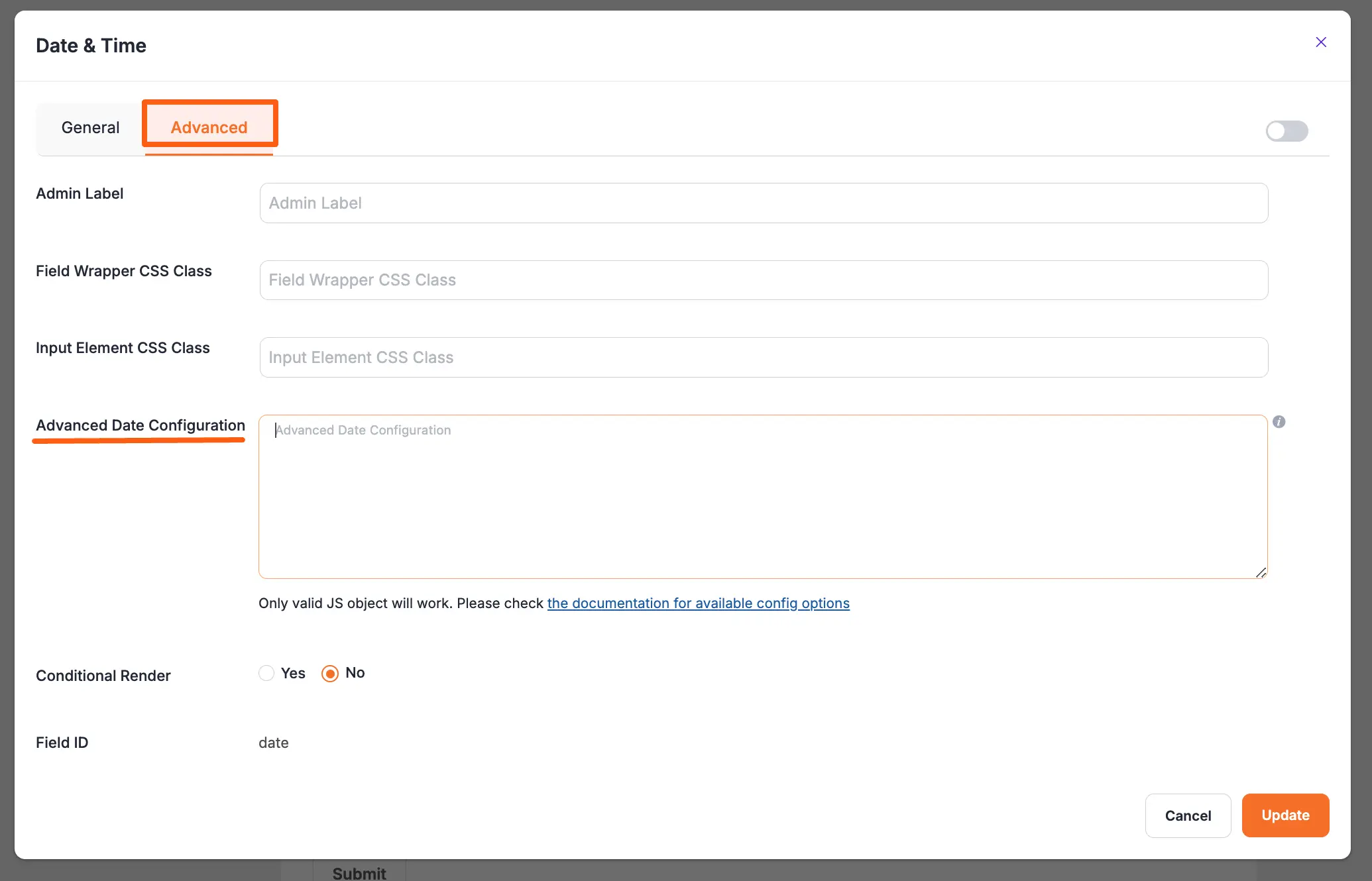
Advanced Configuration #
Paymattic Date and Time field use flatpickr JS library; for advanced users, you can provide the config object in the field’s advanced settings.
Adding the First Day of Week Date #
Now, you can add the start of the week date. You can do this with the help of a custom code; use the code given below:
{
    "locale": {
        "firstDayOfWeek": 1 // start week on Monday
    }
}
Available Options #
| Config Option | Type | Default | Description |
|---|---|---|---|
| altFormat | String | “F j, Y” | Exactly the same as date format, but for the altInput field |
| altInput | Boolean | false | Show the user a readable date (as per altFormat), but return something totally different to the server. |
| altInputClass | String | “” | This class will be added to the input element created by the altInput option. Note that altInput already inherits classes from the original input. |
| allowInput | Boolean | false | Allows the user to enter a date directly input the input field. By default, direct entry is disabled. |
| appendTo | HTMLElement | null | Instead of body, appends the calendar to the specified node instead*. |
| ariaDateFormat | String | “F j, Y” | Defines how the date will be formatted in the aria-label for calendar days, using the same tokens as dateFormat. If you change this, you should choose a value that will make sense if a screen reader reads it out loud. |
| clickOpens | Boolean | true | Whether clicking on the input should open the picker. You could disable this if you wish to open the calendar manually with.open() |
| dateFormat | String | “Y-m-d” | A string of characters which are used to define how the date will be displayed in the input box. The supported characters are defined in the table below. |
| defaultDate | String | null | Sets the initial selected date(s).If you’re using mode: "multiple" or a range calendar supply an Array of Date objects or an Array of date strings which follow your dateFormat.Otherwise, you can supply a single Date object or a date string. |
| defaultHour | Number | 12 | Initial value of the hour element. |
| defaultMinute | Number | 0 | Initial value of the minute element. |
| disable | Array | [] | See Disabling dates |
| disableMobile | Boolean | false | Set disableMobile to true to always use the non-native picker.By default, flatpickr utilizes native datetime widgets unless certain options (e.g. disable) are used. |
| enable | Array | [] | See Enabling dates |
| enableTime | Boolean | false | Enables time picker |
| enableSeconds | Boolean | false | Enables seconds in the time picker. |
| formatDate | Function | null | Allows using a custom date formatting function instead of the built-in handling for date formats using dateFormat, altFormat, etc. |
| hourIncrement | Integer | 1 | Adjusts the step for the hour input (incl. scrolling) |
| inline | Boolean | false | Displays the calendar inline |
| maxDate | String/Date | null | The maximum date that a user can pick to (inclusive). |
| minDate | String/Date | null | The minimum date that a user can start picking from (inclusive). |
| minuteIncrement | Integer | 5 | Adjusts the step for the minute input (incl. scrolling) |
| mode | String | “single” | "single", "multiple", or "range" |
| nextArrow | String | > | HTML for the arrow icon, used to switch months. |
| noCalendar | Boolean | false | Hides the day selection in calendar. Use it along with enableTime to create a time picker. |
| onChange | Function, [functions] | null | Function(s) to trigger on every date selection. See Events API |
| onClose | Function, [functions] | null | Function(s) to trigger on every time the calendar is closed. See Events API |
| onOpen | Function, [functions] | null | Function(s) to trigger on every time the calendar is opened. See Events API |
| onReady | Function, [functions] | null | Function to trigger when the calendar is ready. See Events API |
| parseDate | Function | false | Function that expects a date string and must return a Date object |
| position | String | “auto” | Where the calendar is rendered relative to the input."auto", "above" or "below" |
| prevArrow | String | < | HTML for the left arrow icon. |
| shorthandCurrentMonth | Boolean | false | Show the month using the shorthand version (ie, Sep instead of September). |
| showMonths | Integer | 1 | The number of months showed. |
| static | Boolean | false | Position the calendar inside the wrapper and next to the input element*. |
| time_24hr | boolean | false | Displays time picker in 24-hour mode without AM/PM selection when enabled. |
| weekNumbers | Boolean | false | Enables display of week numbers in the calendar. |
| wrap | Boolean | false | Custom elements and input groups |
Please check flatpickr documentation for more details.
If you have any further questions, concerns, or suggestions, please do not hesitate to contact our @support team. Thank you.