In Paymattic, the Tabular Product Items field lets you display products neatly on your website in a Table, Grid, or Single Line format, making it easy for customers to view their products. This article will guide you on how to add the Tabular Product Items field to the WordPress Site through Paymattic.
Tabular Product Items is a premium feature and you need Paymattic Pro Plugin to use this field.
Additionally, with the Grid Template and Single Line Template, you can build the Shopping Cart/s to showcase your products in your forms.
Adding Tabular Product Items #
To learn how to add the Tabular Prodect Items to the Paymattic Form on your WordPress site, follow the steps with the screenshots below –
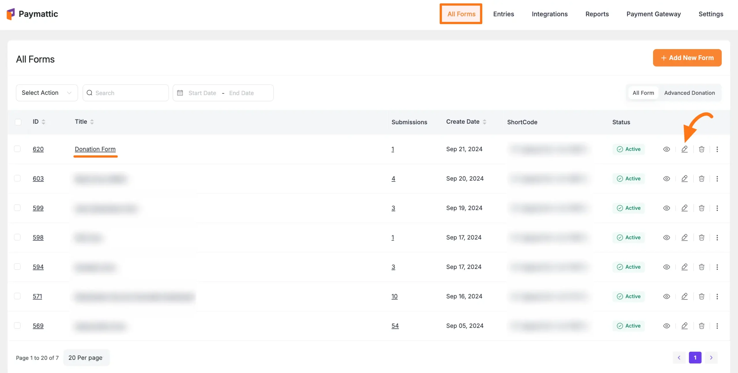
First, go to the All Forms section from the Pymattic Navbar, choose a Form, and click the Pencil/Edit icon to open the Editor page of that form.
If you do not have any existing forms, read these Create a Form from Scratch or Create a Form using Templates documentation.
For example, I choose an existing form to show the whole process.
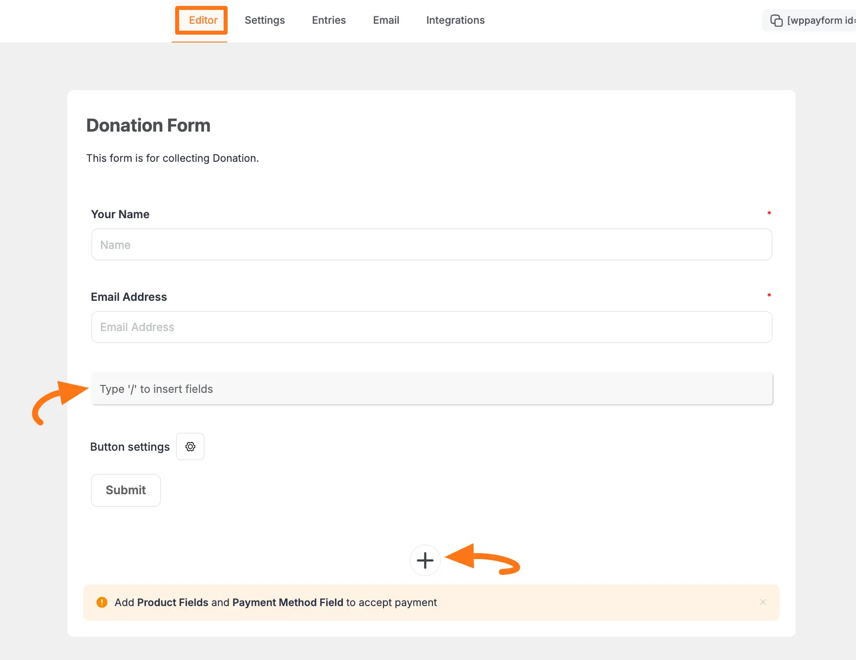
Once you open the Editor page, add the Tabular Product Items fields by typing the “ / ” or clicking the ” + ” icon placed at the bottom.
We always suggest you keep the Name and Email field at the beginning of any Form.
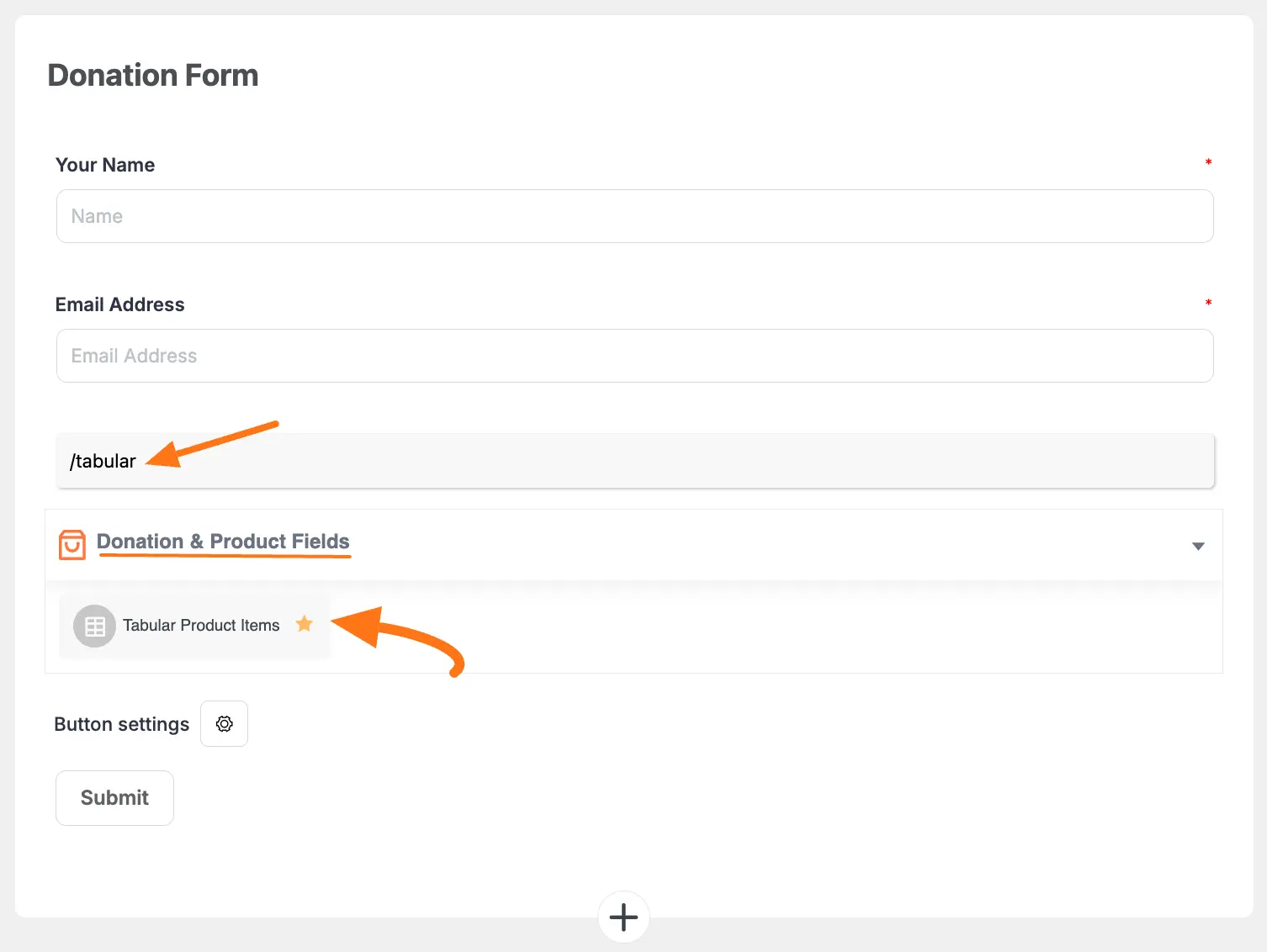
For example, I choose the Type “/” to insert fields option to select the Tabular Product Items field.
Editing/Customizing the Field #
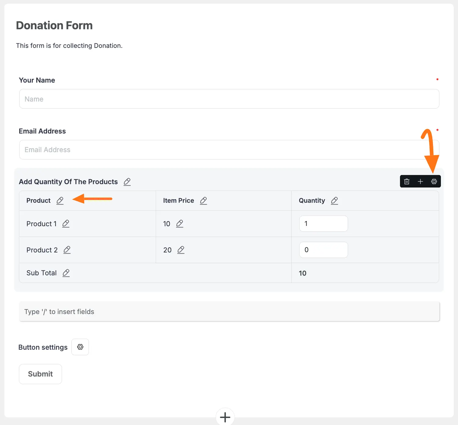
You can see the Tabular Prodect Items field is added to the form.
You can edit the Product’s Name and set the Item’s Price and Default Quantity for each product by clicking the Pencil Icon right next to each column & raw.
To get all the edit options of the Tabular Prodect Items field, click the Settings Icon in the right-side corner.
Now under the General tab, you will get various settings options based on the Tabular Template you will choose for customizing the field.
Here you will get Three Different Templates to showcase your products. These are:
- Table Template
- Grid Template
- Single Line Template
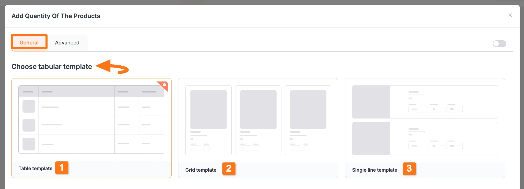
Table Template’s General Settings #
Once you choose the Table template, you will get the following General Settings options shown in the screenshot below.
Once you set up all the settings, click the Update button to save all the customizations.
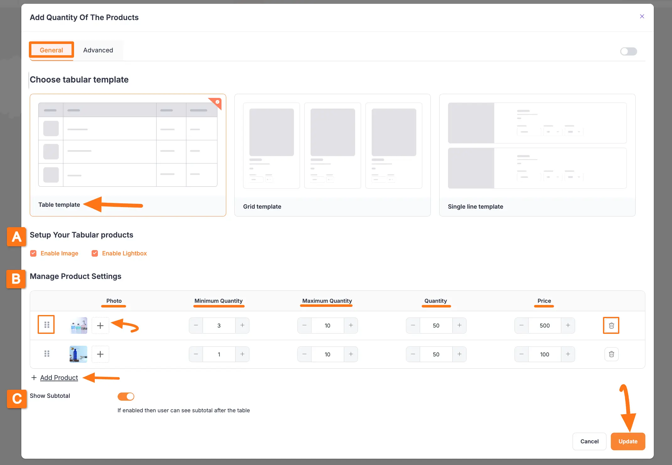
All the Settings under the General Tab for Table Template are briefly explained below –
A. Setup Your Tabular Products #
Here, you will find the following two settings options.
Enable Image: You can turn on the Enable Image button to add photos to your product table.
Enable Lightbox: Switch the Enable Lightbox button to open the image in a centered overlay and dim the rest of the page when the image is clicked.
B. Manage Product Settings #
This option allows you to customize the design of the product table based on your preferences using the following options:
Drag & Drop feature: This lets you move and organize your product raws smoothly.
Photo: Here, you can display your product pictures by adding single/multiple images using the Plus icon.
Minimum Quantity: This lets you set a minimum order quantity for your product, so users cannot order less than this amount.
Maximum Quantity: This lets you set a minimum order quantity for your product, so users cannot order more than this amount.
Quantity: With this, you can set a default order quantity for your products which customers can change later according to their needs.
Price: Here, you can set the base price for your products.
To add new rows to the table, click on the + Add More button. Also, click the Trash Icon to delete a raw anytime if needed.
C. Show Subtotal #
If the option is enabled, users can view the subtotal amount below the table.
Grid Template’s General Settings #
Once you choose the Grid template, you will get the following General Settings options shown in the screenshot below.
Once you set up all the settings, click the Update button to save all the customizations.
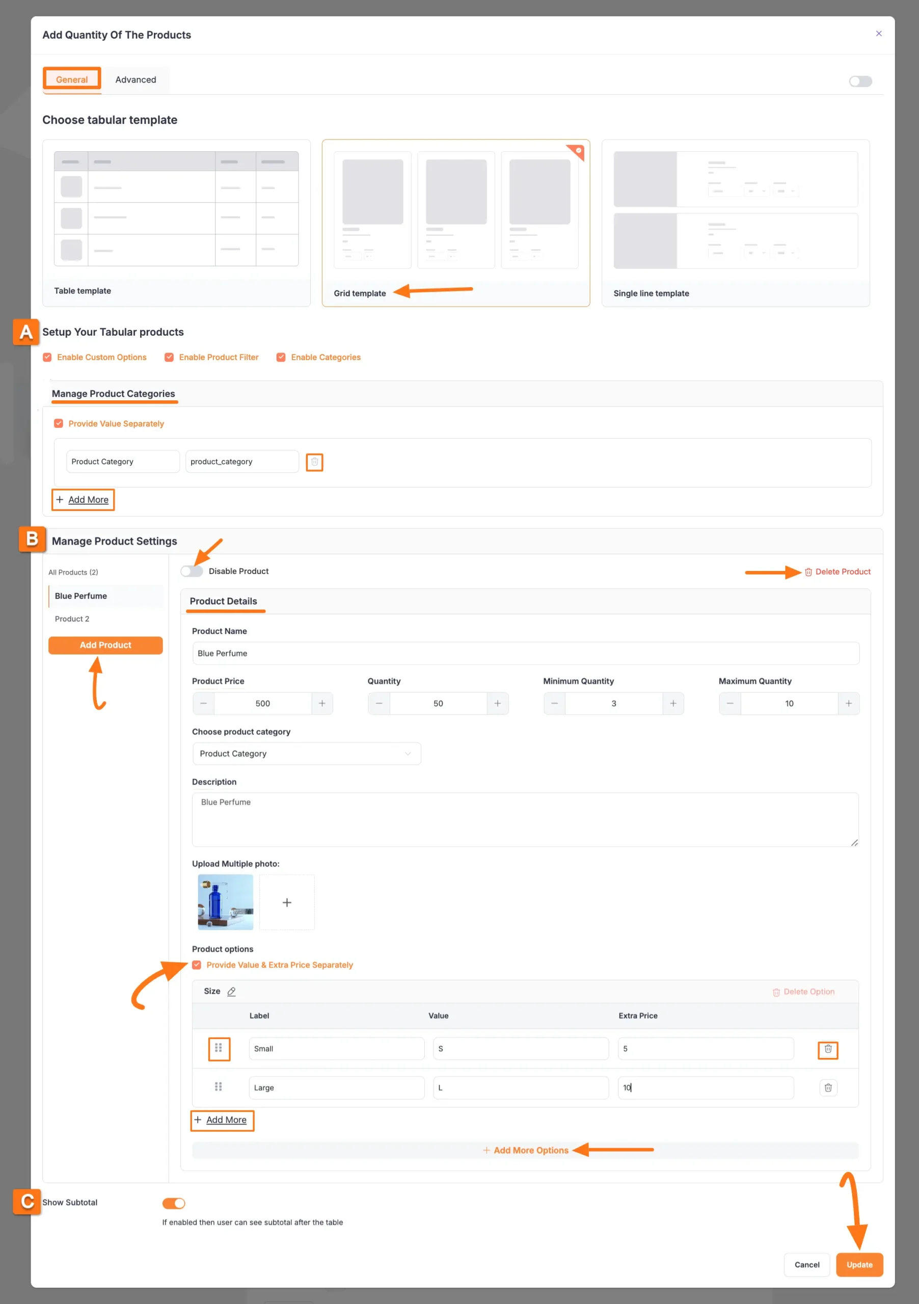
All the Settings under the General Tab for Grid Template are briefly explained below –
A. Setup Your Tabular Products #
Here, you will find the following three settings options.
Enable Image: You can turn on the Enable Image button to add photos to your product table.
Enable Product Filter: It will enable Filter options to make your product searching easier in the front end of your customers.
Enable Categories: Once you enable the option you will get the Manage Product Categories section for creating and sorting your products.
You can add multiple categories by clicking the + Add More button and delete any category by clicking the Trash Icon if needed.
B. Manage Product Settings #
This option allows you to customize the design of the product table based on your preferences using the following options:
Disable Product: Enable this toggle if you want to just simply disable this specific product from showcasing in your form instead of deleting it.
Delete Product: If you want to delete any existing products, click this button.
Add Product: To add as many products as you need, click this Add Product button in the left sidebar.
Product Details: Here, you will get all the settings to customize your product details.
Provide Value & Extra Price Separately: You can set different prices for the same product based on specific criteria to create product variations in your form.
With drag and drop icon, you can organize the raws smoothly with less time and effort. Also, you can add multiple extra prices by clicking the + Add More button and delete anytime by clicking the Trash Icon if needed. Plus, to set multiple criteria for setting the extra price, click the +Add More Options button.
For example, if you have a clothing item with a base price of $100, but you wish to add separately an extra $50 for a Large size on that same product, you can use this setting.
C. Show Subtotal #
If the option is enabled, users can view the subtotal amount below the table.
Single Line Template’s General Settings #
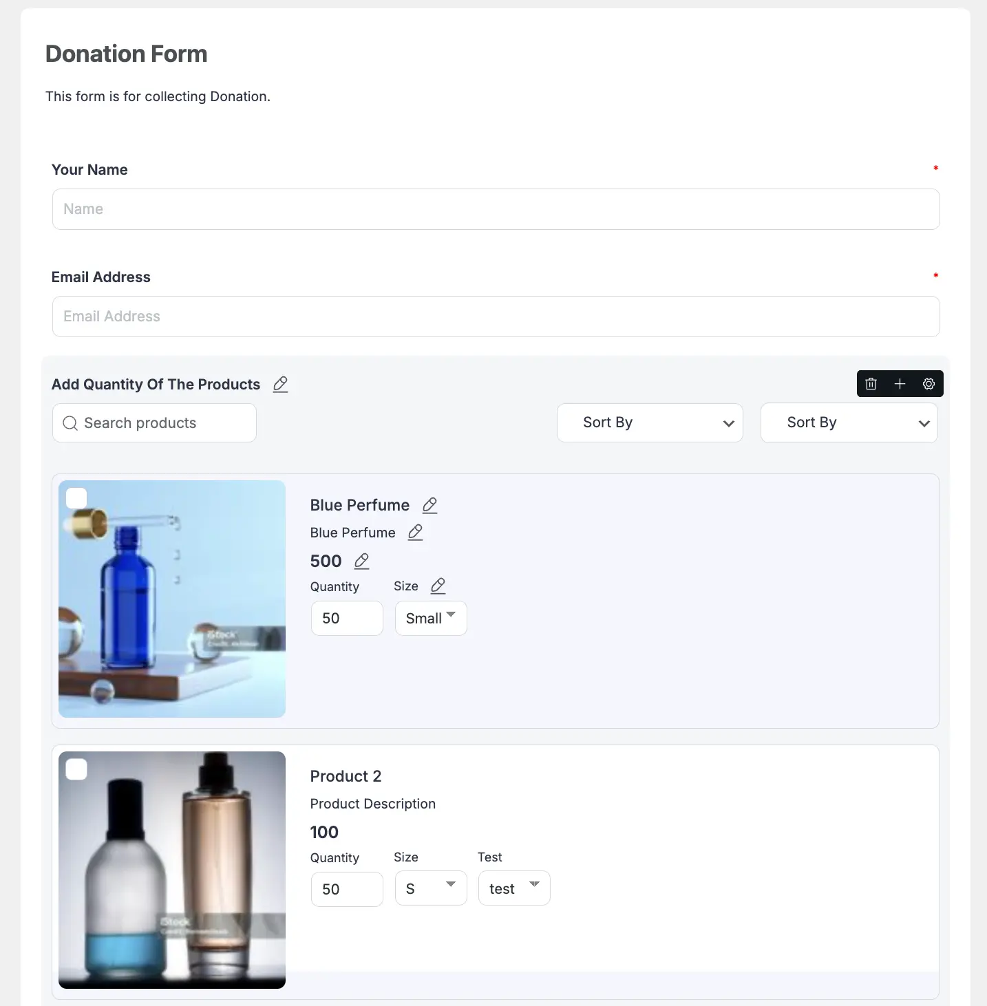
The Single Line template has the same settings as the Grid Template. The difference is that it showcases each product in a single line and displays all products vertically one by one.
Here is the preview of the added Single Line template of the tabular product field in the form Editor.
Advanced Settings #
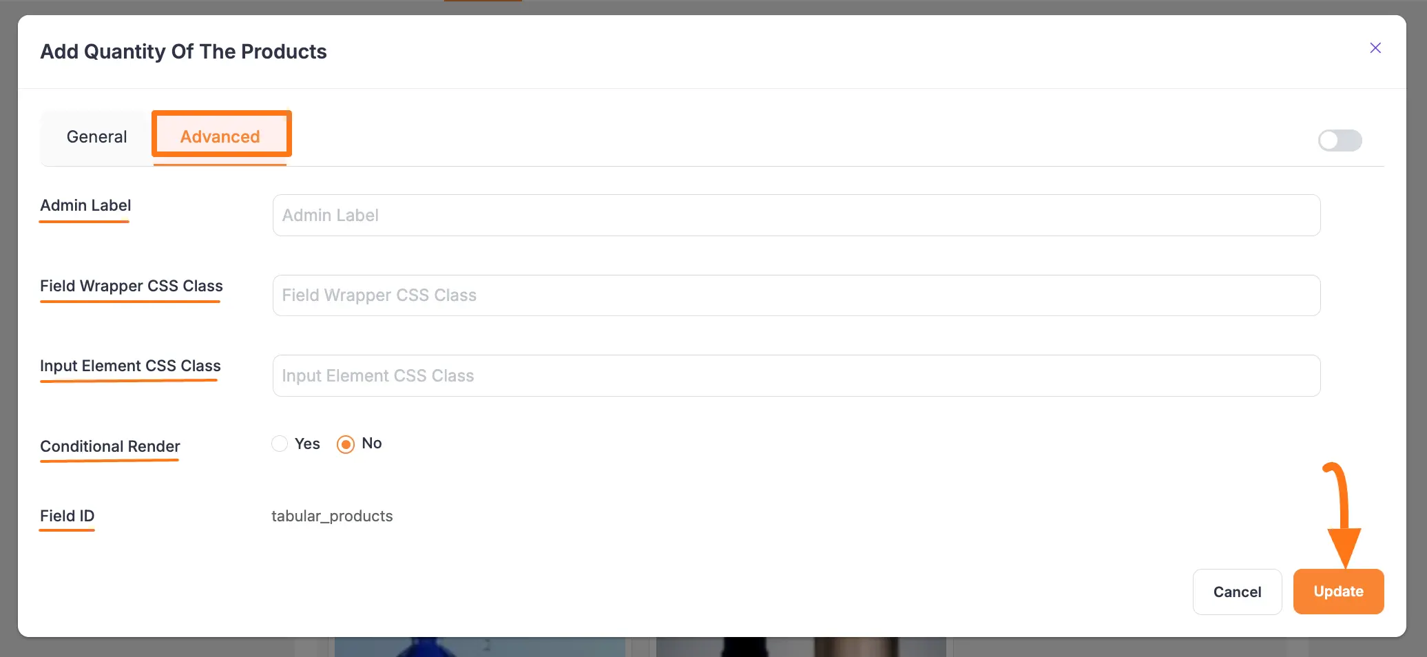
After setting up the General settings based on the desired template, go to the Advanced tab, and you will find some advanced settings for your Tabular Product Items.
The settings options under the Advanced tab are exactly same for all three templates. These are:
- Admin Label: This label is used for the admin wants to see the field’s label from the back end.
- Field Wrapper CSS Class: This is used for adding a Custom CSS/JS for an entire field of a specific form using the Field Wrapper CSS Class element. To learn more, click here.
- Input Elements CSS Class: This is used for adding a Custom CSS/JS for a specific input field of a form using the Input Elements CSS Class element. To learn more, click here.
- Conditional Render: You can set conditional logic to display the field in the form that will be triggered by specific actions taken on a previous input field. To learn more about conditional renderings, click here.
- Field ID: This option is used for adding or tracking form fields. Plus, creating the custom CSS/JS for a specific form field.
Once you finish, click the Update button to save all your configuration.
Embedding Form into Front-end #
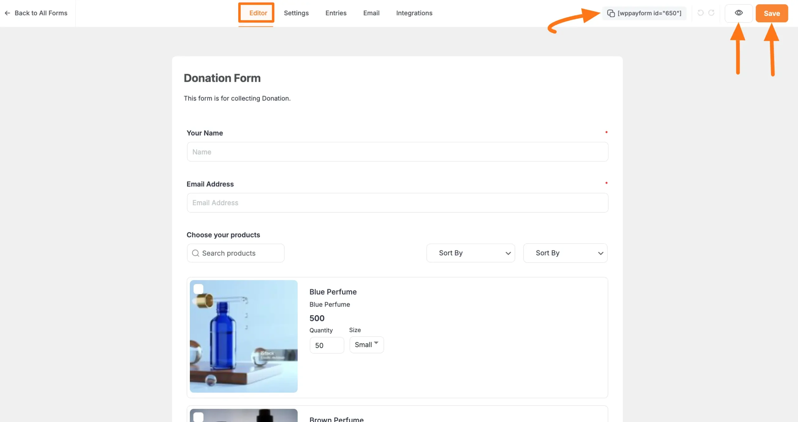
To embed and display the form on a specific Page/Post, copy this Shortcode and paste it into your desired Page/Post.
Once you complete the edit, press the Save button to save all the changes you made. And, to see the Preview of the form, click the Eye icon.
Preview of Tabular Product Items field #
Here is the preview of the Tabular Product Items fields in a Form.
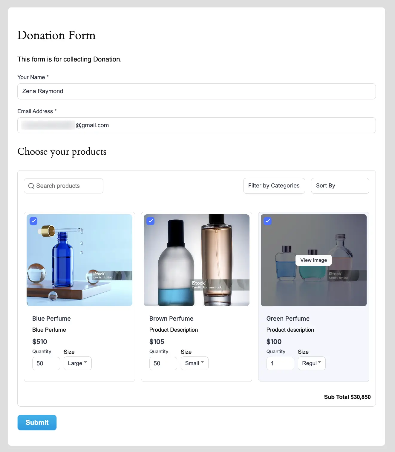
This way you can easily add the Tabular Product Items fields in Paymattic Forms!
If you have any further questions, concerns, or suggestions, please do not hesitate to contact our @support team. Thank you.


